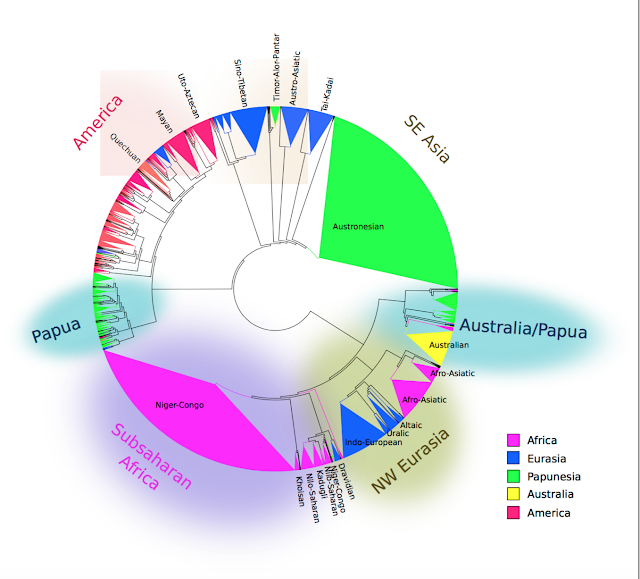
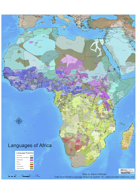
That infographic, again ;)
In 2015 I wrote a blogpost about Alberto Lucas López visualisations of the worlds languages. I answered some frequently asked questions in relation to that visualisation, mostly to do with Ethnologue's definitions of languages, macro-languages and speakers. There's a lot more context needed to fully understand that infographic, and every time I see if re-shared I see the same questions pop up. It's a good infographic, so I understand that it goes viral - but when the same questions come every time it means that more context is needed.
 Since then, Alberto (who is now Senior Graphics Editor at the National Geographic) has released an updated version, which among other things fixes the color of Mexico. I haven't gone through to check what else has been adjusted, but many of the same questions will remain. This is because Ethnologue's classification of what is and what is not a language (which still underlies the visualisation) is still controversial at times and the general public will not known what Ethnologue and the Library of Congress mean by "macro-language".
I might do another blog post going through the visualisation, if there's enough new questions. Post them here or at the old post if you have any :)!
Over and out,
Hedders


Funny how Austria's 8 million German speakers are only shown as "+"...
ReplyDelete