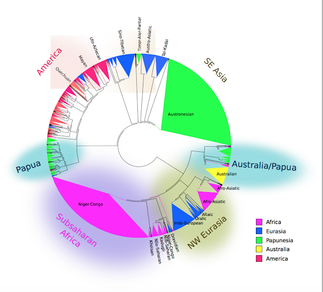
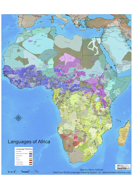
Neat map illustrations from new internet friend
He recently made a post in relation to our old post about illustrating questions about linguistic diversity. For other posts from us with data visualisation/illustration, go here.
While we're on the topic of visualising geographic data (i.e. data somehow tied to a place, such as number of languages etc), go check out Speckman's lab in Eindhoven. They've made a neat kind of map visualization called "necklace maps". If you're really into map visualisation you can even play their game on making cartograms!


Comments
Post a Comment