Some more maps of language diversity
I made some maps of language diversity, to add to Hedvig's long lists of existing info graphics here and here, using data from Glottolog.
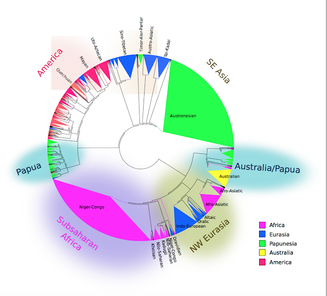
I wanted to make a map showing the number of language families - 272 according to Glottolog, not counting sign languages, artificial languages, creoles, pidgins, and mixed languages. Each curve shows the area in which languages in these families are found. The colors were randomly selected in order to try making the curves distinct from each other, although in some areas these are difficult to make out, such as in southeast Asia.
Try spotting in particular Indo-European, Turkic, Afro-Asiatic, Na-Dene, Quechua and Niger-Congo. Austronesian is the red triangle in the right hand corner, although my curve-plotting algorithm makes it incorrectly cover Australia as well.
 The maps are generated in R using the 'maps' package. Here's a function 'drawcurve' in R for drawing curves of a particular colour around a set of longitudes and latitudes, taken from this stackoverflow page:
spline.poly <- function(xy, vertices, k=3, ...) {
# Assert: xy is an n by 2 matrix with n >= k.
# Wrap k vertices around each end.
n <- dim(xy)[1]
if (k >= 1) {
data <- rbind(xy[(n-k+1):n,], xy, xy[1:k, ])
} else {
data <- xy
}
# Spline the x and y coordinates.
data.spline <- spline(1:(n+2*k), data[,1], n=vertices, ...)
x <- data.spline$x
x1 <- data.spline$y
x2 <- spline(1:(n+2*k), data[,2], n=vertices, ...)$y
# Retain only the middle part.
cbind(x1, x2)[k < x & x <= n+k, ]
}
drawcurve=function(longs,lats,colour){
testpts=structure(list(x=longs,y=lats))
chuld <- lapply(testpts,"[",chull(testpts))
polygon(spline.poly(as.matrix(as.data.frame(chuld)),100),border=colour,lwd=2)
}

The second map shows density of languages. The size of the star on each point is proportional to the number of languages inside a 100 km radius of the point that the star is on. This goes up to 134 in parts of New Guinea. By that scale, most of Europe is too small to register. 100 km is a bit of an arbitrary threshold, but I wanted to illustrate the extreme end of language diversity: the number of languages found inside a radius only slightly larger than the train ride from Nijmegen to Amsterdam (89 km).
This only includes indigenous languages. For example, English is not counted as being spoken in the United States, or anywhere outside of England. If all non-indigenous languages are counted, places like New York apparently have up to 800 languages (English being one of them). In this map, there are no extant languages at all in New York, with the closest being the Algonquian languages of Delaware and Massachusetts.
The highest point of language diversity on the planet, by this measure, is at the Trans-New-Guinea language Kandawo, with 134 languages inside a 100 km radius.


I wanted to make a map showing the number of language families - 272 according to Glottolog, not counting sign languages, artificial languages, creoles, pidgins, and mixed languages. Each curve shows the area in which languages in these families are found. The colors were randomly selected in order to try making the curves distinct from each other, although in some areas these are difficult to make out, such as in southeast Asia.
Try spotting in particular Indo-European, Turkic, Afro-Asiatic, Na-Dene, Quechua and Niger-Congo. Austronesian is the red triangle in the right hand corner, although my curve-plotting algorithm makes it incorrectly cover Australia as well.

spline.poly <- function(xy, vertices, k=3, ...) {
# Assert: xy is an n by 2 matrix with n >= k.
# Wrap k vertices around each end.
n <- dim(xy)[1]
if (k >= 1) {
data <- rbind(xy[(n-k+1):n,], xy, xy[1:k, ])
} else {
data <- xy
}
# Spline the x and y coordinates.
data.spline <- spline(1:(n+2*k), data[,1], n=vertices, ...)
x <- data.spline$x
x1 <- data.spline$y
x2 <- spline(1:(n+2*k), data[,2], n=vertices, ...)$y
# Retain only the middle part.
cbind(x1, x2)[k < x & x <= n+k, ]
}
drawcurve=function(longs,lats,colour){
testpts=structure(list(x=longs,y=lats))
chuld <- lapply(testpts,"[",chull(testpts))
polygon(spline.poly(as.matrix(as.data.frame(chuld)),100),border=colour,lwd=2)
}

The second map shows density of languages. The size of the star on each point is proportional to the number of languages inside a 100 km radius of the point that the star is on. This goes up to 134 in parts of New Guinea. By that scale, most of Europe is too small to register. 100 km is a bit of an arbitrary threshold, but I wanted to illustrate the extreme end of language diversity: the number of languages found inside a radius only slightly larger than the train ride from Nijmegen to Amsterdam (89 km).
This only includes indigenous languages. For example, English is not counted as being spoken in the United States, or anywhere outside of England. If all non-indigenous languages are counted, places like New York apparently have up to 800 languages (English being one of them). In this map, there are no extant languages at all in New York, with the closest being the Algonquian languages of Delaware and Massachusetts.
The highest point of language diversity on the planet, by this measure, is at the Trans-New-Guinea language Kandawo, with 134 languages inside a 100 km radius.


Comments
Post a Comment