Linguistic diveristy, important things to think about concerning maps and hot research topics
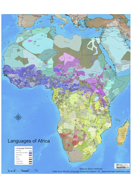
The tumblr The land of Maps recently reblogged a map from the 2004 edition of Ethnologue displaying the linguistic diversity of Africa. I thought I'd just add some brief commentary and information about the kind of research questions this touches upon. Now, Africa is super-diverse don't get me wrong, but this image does not show the full picture. I know Imma party pooper, I've accepted this about myself.
This map is based offa Ethnologue and displays each language of Africa as a polygon shape covering the area where the language is spoken. Ethnologue is a catalog of the worlds languages administrated by SIL. They're also the keepers of certain standards of languages, such as the ISO 639-3 codes for language names. The most recent edition, from 2014, does not feature maps of this kind. They do have maps of smaller areas though, like Nigeria which is one of the most diverse regions of Africa.
In order to see the diversity of Africa we can look at such maps as the one above, but there are a couple it things that are good to keep in mind for a correct reading of the map: family relations, polygons versus dots, population size, contact areas and multilingualism.
a) we're not getting the genealogical dimension clearly, i.e. which languages belong to the same family? What kind of diversity are we interested in? Is just speaking different "languages" enough? What about being similar due to shared genealogy or contact? In fact, we can speak of diversity in at least four different ways:
If your interested in the distribution of typological features across not only areas, but also language families, why not check out the World Atlas of Language Structures sunburst explorer? It's a handy easy to use online tool that lets you explore the 2500+ languages over 166 features (resulting in 69 000+ datapoints) of WALS in a clear and concise way. I've written a post explaining more here.
b) polygons versus dots and populations. There are different opinions how to best display languages on a map, the main one being do we use polygon shapes or dots? They are good for different purposes, it depends on if we want to treat all languages as equally interesting or if we want to grasp the geographical area over which they are spoken and therefore see contact better (polygons). Both of these fail to represent population, for that we can either modify the size of the dots (like Gap Minder does) or distort the size of the areas like Worldmapper does.
I wanted to show how this works, but I couldn't find a map where the polygons of each languages was distorted according to number of speakers/signers per language. What I could find though are maps of amount of languages spoken in an area, one from Ethnologue and one form World Mapper.
Both are using map projections similar to Gall-Peters. Now, we're going from dots to polygons. In the first map each dot represents a language, it is from Ethnologue's previous edition form 2009. Ethnologue assigns each language in their catalog to one country, and then lists countries where they language "is also spoken". They also divide languages into those spoken indigenously and those labeled as immigrant languages, read more here. We're dealing with the indigenous here, and one country per languages (as far as we know). This is comparable to all CLLD-maps where each language has one dot in one location, sometimes in the same as Ethnologue but sometimes not. This is important to know for a correct reading of the map.
Dahl, Ö., 2006. An exercise in "a posteriori" language sampling. Ms, Stockholm University Linguistics Department.
 |
| Ethnologue © 2005 SIL International |
In order to see the diversity of Africa we can look at such maps as the one above, but there are a couple it things that are good to keep in mind for a correct reading of the map: family relations, polygons versus dots, population size, contact areas and multilingualism.
a) we're not getting the genealogical dimension clearly, i.e. which languages belong to the same family? What kind of diversity are we interested in? Is just speaking different "languages" enough? What about being similar due to shared genealogy or contact? In fact, we can speak of diversity in at least four different ways:
- diversity of how many languages are currently spoken in an area (see original map above)
- how that diversity is distributed across speakers/signers, i.e. sure there are lots of languages spoken/signed in a certain area, but most people actually speak one and the same languages. This can be represented by the Greenberg Diversity Index that meaures how likely it is that two random speakers share the same mother tongue, read more here.
- genealogical diversity, how are these languages distributed across families? And here we might want to split this up into top-level families and genera since language families can vary greatly in time depth whereas genera groups are always of max 3500-4000 years making them more suitable for direct comparison
- typological diversity, i.e. when it comes to comparing grammar, phonology, semantics etc cross-linguistically - how similar are the languages? We get contact areas where lots of languages from different families are nevertheless similar in their typological profile. We can measure this for example with the Dahl-distance (Dahl 2006).
If your interested in the distribution of typological features across not only areas, but also language families, why not check out the World Atlas of Language Structures sunburst explorer? It's a handy easy to use online tool that lets you explore the 2500+ languages over 166 features (resulting in 69 000+ datapoints) of WALS in a clear and concise way. I've written a post explaining more here.
b) polygons versus dots and populations. There are different opinions how to best display languages on a map, the main one being do we use polygon shapes or dots? They are good for different purposes, it depends on if we want to treat all languages as equally interesting or if we want to grasp the geographical area over which they are spoken and therefore see contact better (polygons). Both of these fail to represent population, for that we can either modify the size of the dots (like Gap Minder does) or distort the size of the areas like Worldmapper does.
I wanted to show how this works, but I couldn't find a map where the polygons of each languages was distorted according to number of speakers/signers per language. What I could find though are maps of amount of languages spoken in an area, one from Ethnologue and one form World Mapper.
Both are using map projections similar to Gall-Peters. Now, we're going from dots to polygons. In the first map each dot represents a language, it is from Ethnologue's previous edition form 2009. Ethnologue assigns each language in their catalog to one country, and then lists countries where they language "is also spoken". They also divide languages into those spoken indigenously and those labeled as immigrant languages, read more here. We're dealing with the indigenous here, and one country per languages (as far as we know). This is comparable to all CLLD-maps where each language has one dot in one location, sometimes in the same as Ethnologue but sometimes not. This is important to know for a correct reading of the map.
 |
| Ethnologue © 2009 SIL International |
In the second map Worldmapper has taken the same data, hopefully even from the same edition of Ethnologue (they don't say explicitly), with some modifications, read more here. What they've done now is distort the size of countries/territories to show the amount of indigenous languages spoken there.
 |
| Worldmapper © Copyright Sasi Group (University of Sheffield) and Mark Newman (University of Michigan). |
Now, if we compare this map to one where the countries/territories are distorted to represent human population we get a very different view, in particular we get less people and more languages in Nigeria and Papua New Guinea and more people but less languages in China and India.
 |
| Worldmapper © Copyright Sasi Group (University of Sheffield) and Mark Newman (University of Michigan). |
Why are there so many languages in certain areas? Sure, it needs to be said that some of it might be due to overly excited linguists indulging in to much splitting, dividing languages too much. But, that doesn't fully answer the question, and even if it does it needs to be proven. What about self-sufficiently, exogamy, political organization, multilingualism, trade, isolation and time depth of settlement? There are lots of questions concerning the emergence, maintenance and decline of linguistic diversity that need answering, and actually this is a very hot research topic at the moment. One project that seeks to answer such questions is the Wellsprings of Linguistic Diversity-project at Australia National University in Canberra. In fact, yours truly will become a part of that group. If you're into this you should also read this awesome free book by prof Enfield that just-just came out!
c) multilingualism. In the original map that spawned this post there is not clear information on how multilingualism is treated. Do we only see the the languages with the most speakers in a certain area? Many of the areas with the most languages are also ripe with multilingualism.People speak the languages of their parents, the languages of their spouse parents, the languages of the neighboring villages, the regional lingua franca etc. And, not only do they do this now, they've been at this extreme multilingualism for a very long time. How does this work? Well, that just so also happens to be a hot research topic tied into the other question of why there is such diversity in certain areas and not in others. This questions is addressed by the Wellsprings project too, but also by the Crossroads of Multilingualism project of SOAS and the Babel Problem PhD of the language in interaction consortium. The Langscape map that we looked at above does a better job of displaying multilingualism, but is still missing loads of data.
Alright, that's it for now. I hope you've learned something about data visualization of languages on maps and different kinds of linguistic diversity. Be sure to write if you wanna tell us something or ask something.


Is that a digitized David Dalby´s Carte des langues de l'Afrique http://www.linguasphere.info/lcontao/carte-des-langues-de-lafrique.html ?
ReplyDeleteHello friend! The first map of Africa is from Ethnologue, the second one is a screen grab from Langscape.
Delete